Week 8: Visual design
- Lehang Tieu
- Mar 27, 2022
- 9 min read

Updated: May 4, 2022
UXD720
This week I discuss the models of good practice, building my high-fidelity prototype and implementing colour and typography. I also consider feedback from my users, tutors and peers to improve my prototype.
I have learnt the importance of feedback from the usability tests and engaging and sharing my concept with my peers and tutors. It was very insightful to get expert advice and guidance on my work and progress. Some feedback included adding an 'other' option to the personalisation questions so users can freely input their answers if their choice is not available. Moreover, it is beneficial to include tooltips and information to teach users how to use the app.
When I presented my high-fidelity prototype in Figma, it revealed a crucial problem. I realised I didn't understand the difference between heart rate (HR) and heart rate variability (HRV). My prototype designs included both terminologies, and this was incorrect. This problem led me to research the topics using scientific journals and health websites in Google Scholar and Falmouth Library services. Although it would be beneficial to incorporate both HR and HRV in the product, I cannot achieve both due to time constraints.
HR is the average beats per minute. Adults with a HR ranging between 60 - 100 is considered normal (Laskowski 2020). However, many factors can influence the results, such as age, fitness level, medication, and being a smoker. A low HR usually indicates rest, and a high HR can be related to exercise (Elite 2021). Moreover, measuring the HR with the camera phone is much more accurate than measuring HRV (Elite 2021). HRV is the change in the time between heartbeats. A person's health and age determine their HRV, which decreases as people get older (Van Deusen 2021).
After some research, I have chosen to focus on HR with nutrition as they have a strong connection. When you eat, it can change the blood flow, which causes your heart rate to increase (Peconic Bay Medical centre 2019). Eating a large meal or overeating can make your heart work harder, causing it to beat faster. Moreover, the diet, food type and allergies you consume are also related to your changes in HR. For example, processed foods and high carbohydrates can cause increased heart rate leading to weight gain and other health concerns. Good practice of eating includes increasing water intake (6 -8 glasses a day) and controlling the portion size of your meals by monitoring your calories (Zielinski 2022). These practices have been implemented in the prototype design.
Models of good practice
When designing the user interface (UI) of mobile applications, best practices need to be considered. Best practices include prioritising information so that only important content is visible to the user and ensuring the most important content is placed at the top. Legible text on the screens is also crucial to make it readable to users. Moreover, the UI system must provide feedback to the users to keep them informed whilst they interact with the system (Ketterman 2022).
I used material design to help form my prototype designs because it is a flexible and effective design model (Chapman ND). The design is user-friendly and simplified and includes specific rules to enhance the structure and layout. This includes use of icons, colour principles and using coloured text on light backgrounds. For example, text that needs high emphasis will need at least 87% in opacity, medium emphasis needs 60% in opacity and disabled text needs 38% in opacity.
Figure 1: This shows the examples of four good models of practice I have researched. I have discovered that many nutrition and health-based apps use a clean white background and a combination of colours as the foreground.

Psychology of colour
Colour can influence the interface design. The current Nutricoach interface uses hues of green, grey and white. It has a minimal aesthetic design; however, it does not achieve the accessibility guidelines very well. Many of the shading and elements used have a low contrast which may be difficult for users with low visual acuity.
Figure 2: The current Nutricoach app design

Colour can evoke emotions and memories but can have different meanings depending on the country and culture (Bodrogi 2003: 131). For example, red and purple symbolise royalty in England, whereas red signifies anger in the USA. Studies reveal that blue is calming and evokes a sense of security whilst yellow can create frustration and anger (O’Connor 2011: 233). Shades of soft lavender reveal wisdom, spirituality and positive transformation (Reyes 2019). Lots of green hues are used in health apps. Studies show that green invokes balance and harmony, relieving stress levels and health-giving (O’Connor 2011: 231).
Design system
Design systems are made of components of visual and interactive designs, such as layout, shape, colour, typography and branding. The advantage of having a design system is that it reduces the effort, helps create consistent designs, and allows for collaboration (Moore et al. 2020: 2).
I have created a design system for my prototype. I have renamed the product to Pulse, replacing the existing name, Nutricoach. The reason is that the app did not relate to coaching and the user cannot speak or be advised by nutrition professionals. Changing the name to Pulse, shows that the app is related to heart rate and health.
Colour
I have experimented with different colour combinations and tested them with my users. My initial design included different hues of green with some additional accent colours of yellow, coral and sky blue. Although the colour combinations symbolise health and harmony, I wanted the user to feel a sense of calm and positive change and motivation.
Figure 3: Colour palette experimentation
Initial palette (version 1)

Updated palette (version 2)

Final palette (Version 3)

After much experimentation and user feedback, I have chosen blue, lavender, shades of grey and white as my primary colours. These colours invoke feelings of serenity and positive transformation, which are associated with wellness to influence the user. The colours also contrast well when used together. The accent colours are additional hues that will be used in graphics, graphs and indicators. I have also included a colour combination showing the pairing of hues together.
I have presented my high-fidelity prototype designs with my users in the third round of usability tests. Some users noticed that the pastel colours didn’t work well in contrast with the white background, especially the iconography. Therefore, I experimented a little further with the colours and accessibility checker. I removed the blue and lavender gradient colour as this did not work well in contrast with the white and dark coloured text. I used the primary blue and updated the other colours to have similar saturation and value.
Users stated there wasn't a clear distinction between the primary colours used. There was a mix of blue and purple and little platinum grey, which gave no colour structure to the layout. Therefore, I implemented the 60-30-10 approach, which is used according to a ratio (Adelugba 2020). This useful technique is a great starting point for incorporating colour and creating a well-balanced design (Babich 2019).
Background/system: 60%, platinum grey
Primary colour: 30%, blue
Secondary colour: 10%, purple
Figure 3, final palette shows the final colour palette for my Pulse brand.
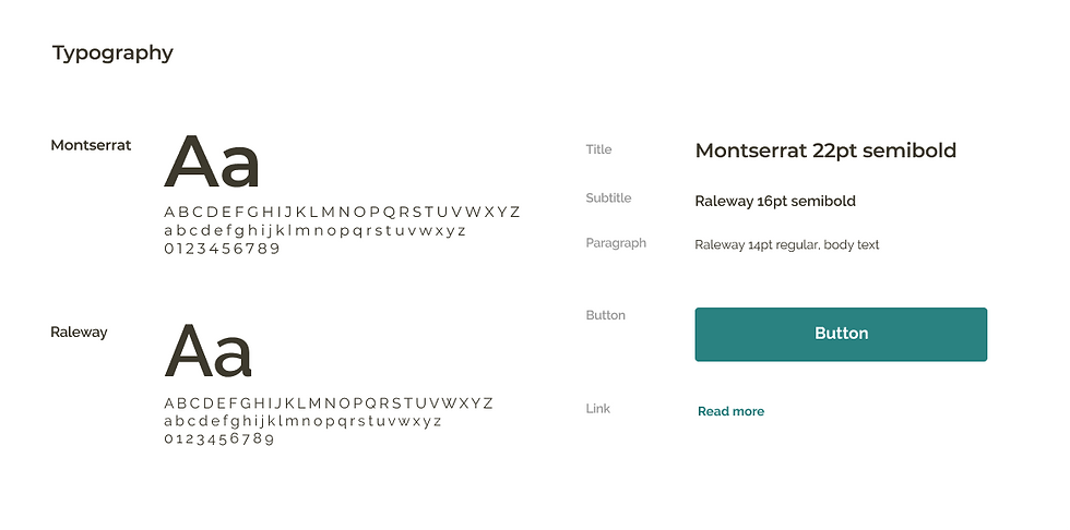
Typography
I have researched and browsed different types of fonts appropriate for my design using Font Pair, Google fonts and Typ.io. I first experimented with Montserrat and Raleway fonts. Raleway is a sans-serif typeface family with an elegant look, and Montserrat was inspired by old posters and signage across the neighbourhoods of Buenos Aires (Del Peral 2017; McInerney et al. 2016). However, I wanted to choose a font that signified wellness that was clearer for my users.
I browsed through Font Pair, found the Proxima Nova font, and tested this with Montserrat. I chose these fonts because they are readable and slightly rounded, making the text more inviting. I have made sure the text style is legible across screens, including appropriate digital interface sizing. Digital text size ranges from 14 - 22 pts with footers or navigation elements at 10 pt. I have purposefully used larger fonts to cater to older adults, which will be my primary target users.
Figure 4: Font development
Initial font pairing (version 1)
Updated font pairing (version 2)

Final typography with primary and secondary buttons (version 3)
I have chosen to use the ghost button as my secondary button, which has a minimal appearance. This helps distinguish the primary and secondary buttons apart and implements the 60-30-10 rule of colour.

Logo
I also experimented with logo designs for Pulse. My tutor suggested thinking about colours and animals that signified wellness and health. I initially thought of birds which would go well with the blue palette. However, it didn’t quite work out because I couldn’t feel it had a connection with the heart rate concept. I played around with shapes and decided to use two rounded rectangles to form a heart shape. This had a stronger connection to Pulse, and I wanted to make the concept clear to users. Moreover, the logo design is simple and minimal, consistent with the brand.
Figure 5: Logo design
Initial logo design

Final logo design

High-fidelity prototype
I have started to build my high-fidelity prototype in Figma. I implement a flat design style that consists of two-dimensional (2D) elements and a selection of bright colours (‘Flat Design’ 2022). However, the design of 2D elements does not indicate if the elements are clickable, which may affect how the user will interact with the app. Therefore, I use a combination of flat design and 2D elements to increase usability. For example, in the 1-Goals frame (figure 5), the options showing the different diet types are designed with shadows to show these boxes are clickable.
Reflection
I have learnt research is essential at the start of the project to understand the topics before developing the product. This problem arose because I assumed that heart rate and heart rate variability were the same meaning. This issue has taught me not to assume and always conduct thorough research.
Colour has different meanings and importance depending on the country and culture. I find it interesting to learn about different perceptions of colour and how they can influence people’s emotions. To improve this process, perhaps I could involve the users more with the colour and typography elements to enhance my design system. I could perform usability tests by showing the different variations of colour choices and gather feedback.
Although I made a positive start on my prototype using Figma, I started a little later than I originally planned in my SMART goal 2. Hopefully, this won't be an issue, and I will have time to implement all of the design features. One of the reasons I fell a little behind was because I had to consider the availability of my users for the usability tests. Next time, I could create a schedule or Gantt chart to map out all the activities, including contingency time to help structure my time or even time-box my tasks so I don't fall behind.
I have conducted another usability test to develop my designs further and obtained interesting insights regarding accessibility. I only had time to test with one user and my peers, but to improve this, I would conduct a few more tests to see whether other users had similar feedback.
I would like to start to add interactions and animations to my prototype in Figma and research tutorials and videos to support my practice and learning. I will try to create my own graphics and icons if I have some time. Although this is not a significant priority, it is helpful to learn this new skill. This may be essential if I am planning to become a UI Designer. However, since enrolling on this master's, I am open to learning many skills in different areas of UX.
References
ADELUGBA, Ayobami. 2020. ‘How the 60-30-10 Rule Saved the Day’. UX Design CC [online]. Available at: https://uxdesign.cc/how-the-60-30-10-rule-saved-the-day-934e1ee3fdd8 [accessed 11 Apr 2022].
BABICH, Nick. 2019. ‘6 Simple Tips On Using Color In Your Design’. UX Planet [online]. Available at: https://uxplanet.org/5-simple-tips-on-using-color-in-your-design-40916d0dfa63#:~:text=The%2060%E2%80%9330%E2%80%9310%20Rule&text=The%20idea%20is%20simple%20%E2%80%94when,remaining%2010%25%20of%20the%20design. [accessed 11 Apr 2022].
BODROGI, Peter. 2003. ‘Chromaticity Contrast in Visual Search on the Multi-Colour User Interface’. Displays 24(1), 39–48.
CHAPMAN, Cameron. 2022. ‘Why Use Material Design? Weighing the Pros and Cons’. Toptal [online]. Available at: https://www.toptal.com/designers/ui/why-use-material-design [accessed 1 Apr 2022].
ELITE, H. R. V. 2021. ‘Heart Rate Variability vs. Heart Rate’. Elite HRV [online]. Available at: https://elitehrv.com/heart-rate-variability-vs-heart-rate#:~:text=While%20heart%20rate%20focuses%20on,variability)%20between%20successive%20heart%20beats. [accessed 24 Mar 2022].
‘Flat Design’. 2022. Interaction Design Doundation [online]. Available at: https://www.interaction-design.org/literature/topics/flat-design [accessed 22 Mar 2022].
KETTERMAN, Shane. 2022. ‘Mobile UX Design Constraints, Best Practices, and Working with Developers’. Toptal [online]. Available at: https://www.toptal.com/designers/ux/mobile-ux-design-best-practices [accessed 17 Mar 2022].
LASKOWSKI, Edward R. 2020. ‘What’s a Normal Resting Heart Rate?’ Mayo Clinic [online]. Available at: https://www.mayoclinic.org/healthy-lifestyle/fitness/expert-answers/heart-rate/faq-20057979#:~:text=A%20normal%20resting%20heart%20rate%20for%20adults%20ranges%20from%2060,to%2040%20beats%20per%20minute. [accessed 24 Mar 2022].
MCINERNEY, Matt, Pablo IMPALLARI and Rodrigo FUENZALIDA. 2016. ‘Raleway’. Google Fonts [online]. Available at: https://fonts.google.com/specimen/Raleway#about [accessed 1 Apr 2022].
MOORE, Robert J., Eric Young LIU, Saurabh MISHRA and Guang-Jie REN. 2020. ‘Design Systems for Conversational UX’. In Proceedings of the 2nd Conference on Conversational User Interfaces. 1–4.
O’CONNOR, Zena. 2011. ‘Colour Psychology and Colour Therapy: Caveat Emptor’. Color research and application 36(3), 229–34.
PECONIC BAY MEDICAL CENTRE. 2019. ‘Why Your Heart Pounds Fast after Eating’. Peconic Bay Medical centre [online]. Available at: https://www.pbmchealth.org/news-events/blog/why-your-heart-pounds-fast-after-eating#:~:text=Eating%20does%20cause%20changes%20in,heart%20rate%20to%20go%20up. [accessed 24 Mar 2022].
DEL PERAL, Juan. 2017. ‘The Montserrat Font Project’. Github [online]. Available at: https://github.com/JulietaUla/Montserrat [accessed 1 Apr 2022].
REYES, Maridel. 2019. ‘Eight Paint Colors That Promote Wellness at Home’. Martha Stewart [online]. Available at: https://www.marthastewart.com/1541451/paint-colors-boost-wellness [accessed 27 Mar 2022].
VAN DEUSEN, Mark. 2021. ‘Everything You Need to Know About Heart Rate Variability (HRV)’. Whoop [online]. Available at: https://www.whoop.com/thelocker/heart-rate-variability-hrv/ [accessed 24 Mar 2022].
ZIELINSKI, Allison R. 2022. ‘Overeating and Your Heart’. Northwestern Medicine [online]. Available at: https://www.nm.org/healthbeat/healthy-tips/nutrition/overeating-and-your-heart [accessed 24 Mar 2022].


Comments